I like both versions to be honest.
(HEY YOU!! We hope you enjoy! We try not to run ads. So basically, this is a very expensive hobby running this site. Please consider joining us for updates, forums, and more. Network w/ us to make some cash or friends while retro gaming, and you can win some free retro games for posting. Okay, carry on 👍)
“What are your thoughts on how the Super Nintendo’s look was changed from the Super Famicom in Japan?
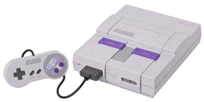
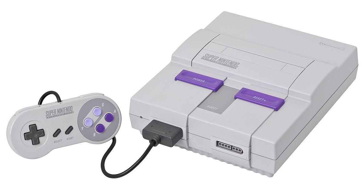
I remember there being a small bit of controversy, with readers writing into magazines about how boxy and ugly the US design was from the Japanese model. And frankly, it never really bothered me back then.
And while it doesn’t really bother me still, I do have to wonder why they went with this look, as I honestly think the Japanese design is more rounded and pleasant. I seem to remember reading once that the people at Nintendo of America thought the Super Famicom looked like a loaf of bread or something. I don’t see that at all. It looks quite sleek to me.
Whatever it looked like, it was an awesome console.”
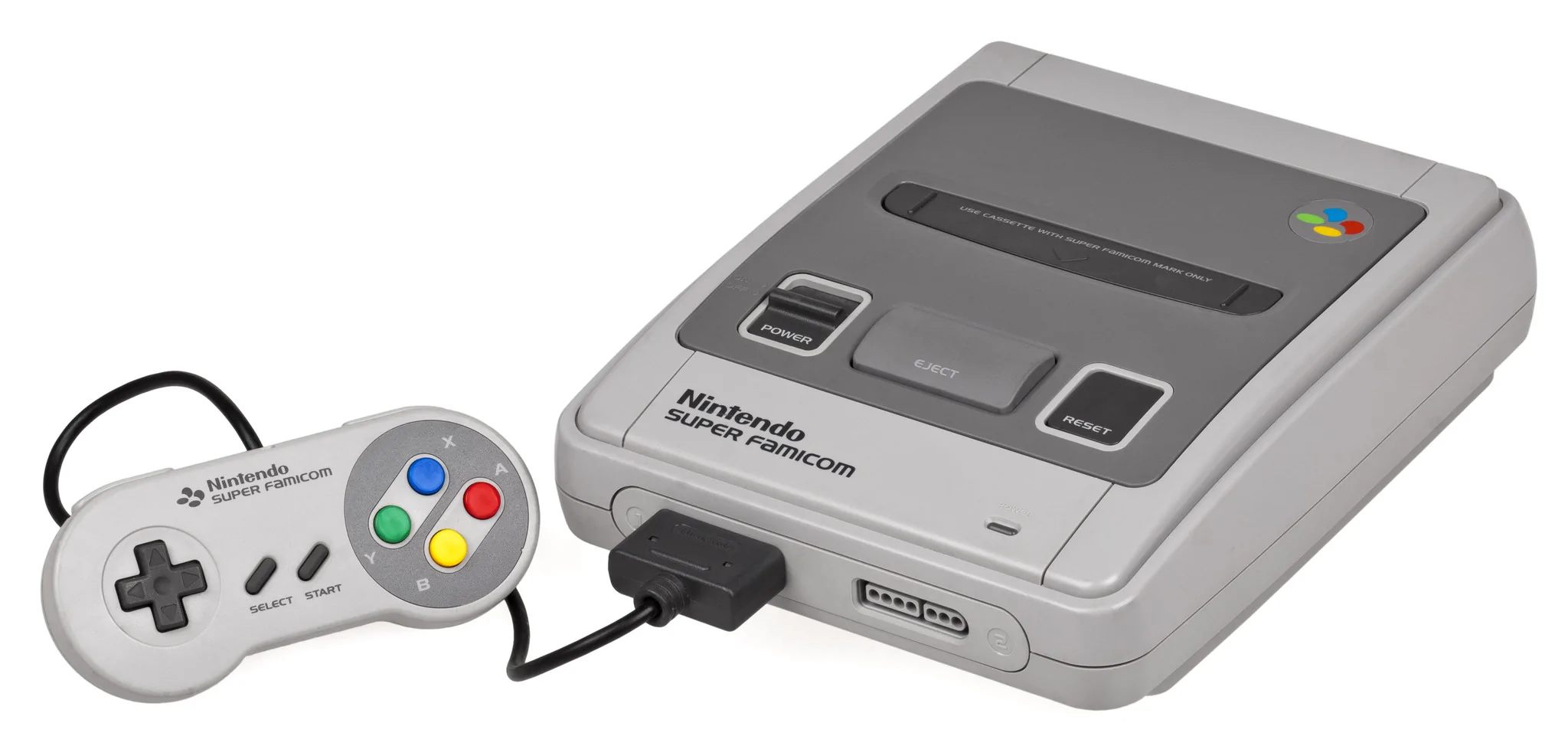


Our PAL Snes’ in Australia and Europe are identical to Japan and I have always been intrigued by the US models and the purple colour scheme and the boxy square cartridges!
I believe I read awhile back somewhere it was to make sure you couldn’t store food on top of it easily, drinks especially.
It still doesn’t bother me, I’ll take either.
I did get one of each controller when I bought my 8Bitdo controllers for my SNES classic
To me it looks like it came out in early to mid 80s. Recently I was deciding on ordering an original SNES from Ebay. I’m from Europe, the European SNES looks exactly like the Japanese Famicom, but I don’t like the 50Hz PAL speed of games, so when it comes to NES and SNES games I always prefer US ports. So the dilemma was between a US SNES and a Super Famicom because they’re both NTSC. I chose the SFC solely for its look. How shallow am I. 😁
I honestly really like both designs. The US version is more nostalgic to me of course, but the JP/EU version is also pretty sexy. Always loved the colored buttons
I know the controller buttons were changed to make two buttons concave, because it made them easier to find by touch alone. Which I do prefer. As far as the button colors, I guess they were changed to match the system colors.
http://playingwithsuperpower.com/the-thought-behind-super-nintendo-s-design/
I like both
I think the PAL version is nicer but there’s something about the purple that screams early 90s
I’m pretty obsessed with modern handhelds from Retroid and Anbernic, and my favorite colorways are the purple SNES and GameBoy inspired models.
Nintendo of America wanted something “special”, angular like a gunship. 😉
Over here in Europe we had the Rounded version (bottom picture) when I first saw the American version I thought it was some sort of cheap knock off version! No idea why they changed it for US….
30 years ago I thought: The SNES is uglier, but some day when I’m no longer expecting the look of the Super Famicom I’ll come to appreciate how it looks.
It’s still ugly. They should have gone with the Super Famicom.
Why is it they took one of the most gorgeous systems out there and changed it for the US market, yet took the N64 as-is?
I was 12 when SNES first came out. I honestly didn’t care what it looked like.
I used to like the Japan/PAL design more, but I’ve grown more fond of the NA version over the years, and like the concave X and Y buttons on the NA version, but like the colors on the Japanese model better.
Being European i feel that the US redesign is super weird and lacks the original’s charm.
In a similar vein, I think Mega Drive was a cool video-gamey name for the time while Genesis was trying too hard being a god damn out of place biblical reference.
But we also got Lylat Wars instead of proper Star Fox, and ya know what? That’s cool too.
I didn’t know what a famicom was when the snes came out so I didn’t know any better but the US snes is one of the ugliest consoles Nintendo ever made.. though in hein sight, the famicom and top loader nes where pretty ugly compared to other consoles that came out